Времена, когда сделать градиент на сайте можно было только с использованием картинок давно прошли. Теперь достаточно просто создавать градиенты внутри CSS стилей.
Для того, чтобы задать градиент используется свойство background-image или сокращенный вариант background-image . И мы можем создать как линейный так и радиальный градиент, прописав значения либо linear-gradient, либо radial-gradient и указав начальный и конечный цвета. Вот пример синтаксиса:
Поменять направление возможно, указав его вначале, перед первым цветом.
Если заменить этот параметр на to top right вы получите диагональный градиент. Такой же эффект можно создать, указав параметр в градусах, например, 45deg .
Вы можете использовать больше чем 2 цвета, и цвета можно записать в том числе и по названию.
Каждый из четырех цветов будет занимать равное количество доступного пространства, что даст нам гладкий и сбалансированный градиент.
Если мы хотим, чтобы один цвет занимал больше места, чем другой, можно добавить значение в процентах непосредственно после цвета. Потренируйтесь на градиент css генераторе выше.
Радиальный градиент
Используем все, что мы уже узнали ранее, чтобы создать радиальный градиент. На самом деле это довольно просто, достаточно в начале указать значение radial-gradient .
Такой радиальный градиент принимает форму родительского блока, поэтому вместо круга мы получили эллипс. Чтобы градиент был в форме круга независимо от пропорций родителя, необходимо указать ключевое слово circle .
К тому же мы можем указать где будет центр радиального градиента. Давайте сделаем так, чтобы он был в левом верхнем углу:
Практическое использование CSS градиента
Давайте попробуем использовать градиент более оригинальным способом.
Градиент поверх картинки
Ниже вы видите пример слоя с градиентом поверх изображения. Здесь мы использовали полупрозрачные rgba цвета.
Свойство background может принимать сразу несколько значений. При этом первое будет верхним слоем, а последнее — нижним.
Градиент в тексте
Градиент в тексте — это классный эффект, хотя и не полностью поддерживаемый в чистом виде. Вместо него мы используем свойство background-clip , это что-то вроде хака, но отлично работающего хака.
Возьмем элемент, в данном случае h1, и применим к нему градиент. Свойству background-clip присвоим значение text, это удалит фон из всего блока, за исключением текста. И, конечно же, следует сделать свойство color прозрачным, иначе мы не увидим градиент.
Профессиональная разработка сайтов под заказ
Прекрасный способ визуально выразить главную мысль
Ultimate CSS Gradient Generator
A powerful Photoshop-like CSS gradient editor from ColorZilla.
Enter existing gradient CSS to import
Import from an image-based gradient
Browser compatibility
IE9 support (?) Maximize compatibility
What’s new
- » Don’t generate older Opera, IE10 Preview, Webkit syntax by default (turn back on using «Maximize compatibility» mode)
- » Browser Compatibility panel showing supported browser versions, usage stats etc.
- » Support for radial and diagonal linear gradients
- » Support for full multi-stop gradients in Internet Explorer 9 (IE9) using SVG
- » Support for Sass SCSS format using Compassmixins (needs latest beta of Compass)
- » Copy to clipboard button for quickly grabbing the generated code
- » Easy resizing of preview panel by dragging its corner
Previous versions
- » Opacity support
- · Create transparent css gradients, or add fade-in, fade-out, semi-transparency and similar effects
- · Add any number of opacity stops to your gradient
- · Supports opacity stops at any position — completely independent of color stops
- · Automatically switch to rgba/hsla color output mode when transparency is used
- · Outputs older Internet Explorer opacity format (yes, this will even work with IE6!)
- · Opacity support when importing from CSS
- · Supports importing gradients with transparency from an image
- » New ‘Adjustments’ panel — tweak your gradient or create new flavors
- · Adjust hue, saturation and lightness
- · Reverse current gradient
- » Added support for 4 new gradient formats:
- · IE 10+
- · Newer Webkit
- · Opera 11.10+
- · W3C
- » Import from an image — convert an existing gradient image to CSS
- · Supports complex multi-stop gradients
- · Upload an image or import from an image URL
- » Import from CSS — enter existing gradient CSS in various formats and import it into the tool
- » Save your gradients as new presets
- · Edit your gradient, enter its name and hit ‘new’
- · Remove any of your preset gradients using its context menu (right click)
- · Your gradient presets will be persisted in the tool across sessions
Читайте также: Устройство генератора для чайников
About
The Ultimate CSS Gradient Editor was created by Alex Sirota (iosart). If you like this tool, check out ColorZilla for more advanced tools such as eyedroppers, color pickers, palette editors and website analyzers.
As you might know, HTML5 introduced many exciting features for Web developers. One of the features is the ability to specify gradients using pure CSS3, without having to create any images and use them as repeating backgrounds for gradient effects.
Important: You’ll need a recent version of Firefox, Chrome, Safari, Opera or IE to use this Gradient Generator. The resulting CSS gradients are cross-browser — they will work in these browsers and will also fall back to a simpler gradient in older versions of Internet Explorer.
Features
- Powerful Photoshop-like interface
- Cross browser CSS output
- Horizontal, vertical, diagonal and radial gradients
- Complex multi-stop gradients
- Opacity support with multiple opacity stops
- Hex, rgb, rgba, hsl, hsla color formats
- Support for full multi-stop gradients with IE9
- Import from image (convert image gradient to CSS)
- Import from existing CSS
- Adjust gradient by hue, saturation, lightness
- More than 135 gradient presets
- Saving custom gradient presets
- Sass output
- Flexible preview panel
- Gradient permalinks for sending and sharing
- More soon!
The main gradient control allows you to:
- » Adjust the gradient stop position by dragging the stop marker
- » Adjust the stop color by double clicking on the stop marker
- » Delete a stop by draggin the stop marker up or down
- » Add a new stop by clicking anywhere in between the existing stop markers
You can use the ‘Stops’ panel to conrol the color and the position of the currently selected stop more precisely.
The ‘Preview’ panel allows previewing the current gradient as a vertical or horizontal one, and also allows quickly previewing how the Internet Explorer fallback gradient will look in IE.
Finally, the ‘CSS’ panel always has the CSS for the current gradient for easy copying and pasting into your stylesheet. You can also use this panel to import an existing gradient CSS into the tool.
Credits
The ‘Ultimate Web 2.0 Gradients’ preset gradients were derived from work by deziner folio and SGlider12.
The Color Picker is a minor adaptation of John Dyer’s Color Picker.
The Base-64 encoder function is from webtoolkit.
Vivid Gradient Generator Tool
Gradient Type
Interpolation
Angle (deg)
Position
Easing
Precision
Export Gradient
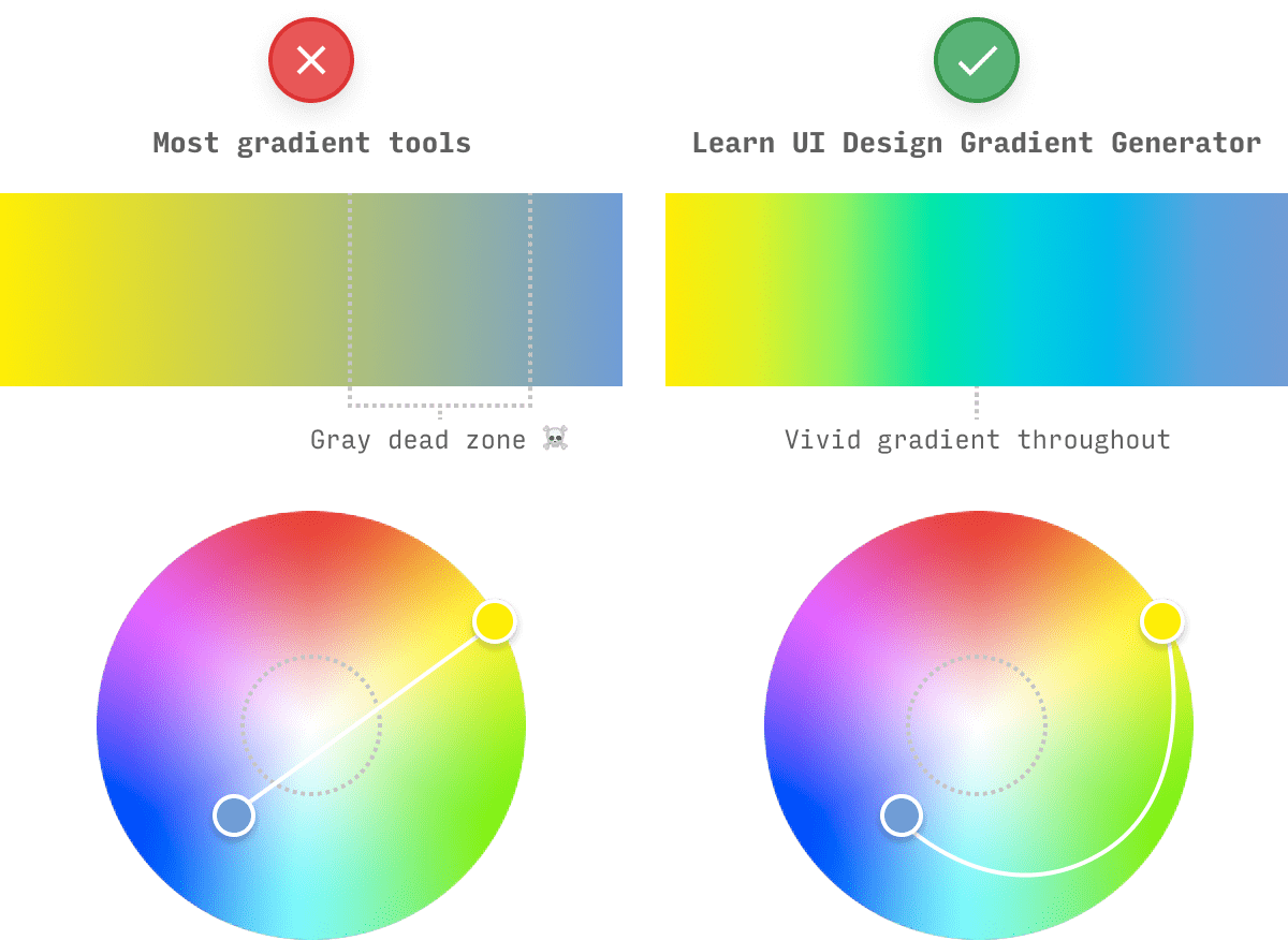
Why this gradient generator is better than others
When you try to create gradients across a wide range of hues, you often will see a gray dead zone в пёЏв„ў in the middle of your gradient. Why is this worth a ridiculously ominous emoji? Because it means your gradients look like this:

Color geeks: this is a slight approximation, since we’re squishing a cross-section of a cube into a circle.
Put simply: to get a gradient that avoids the dreaded gray dead zone в пёЏ, you don’t draw a straight line from A to B, you draw a biiiig curve.
Or, to be more accurate/geeky: we interpolate the gradient in a hue-based color system, such as HCL, HSB, or HCL (not RGB) 🤓. This avoids the line of gray that goes through the center of every color space. Design apps, online gradient tools, and even CSS all fail in this regard – so I made this tool!
Читайте также: Генератор победителей репостов чисел
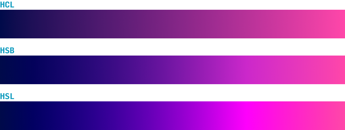
Color Gradients in HCL, HSB, and HSL
Currently, you can create gradients in 3 different color systems in this tool, which yield slightly different results. Here’s the skinny:
- HCL (hue-chroma-luminance): The default choice of this tool, HCL is an amazing color system that not only creates beautiful, rich gradients across a wide range of hues, but does so in a perceptually smooth way. If you were to view the gradient in grayscale, you’d see only a smooth transition from a lighter to a darker gray – preventing the awful “banding” that you’ll see in some hand-picked gradients. (Note: the perceptually uniform nature of HCL also makes it great for data visualization color palettes)
- HSB (hue-saturation-brightness): While not perceptually uniform, sometimes HSB will offer a more interesting (and vivid) take on a gradient between two stops. In particular, if your HCL gradient has an ugly brown-yellow in it, try checking out the HSB version. HSB is a fantastic color system for designers, and I’ve written a comprehensive guide to HSB.
- HSL (hue-saturation-lightness): HSB and HSL will often be very similar, particularly in bright gradients. Nonethless, sometimes it’s worth seeing both. Also, notice the pink “band” in the HSL gradient above – that’s essentially a little spike in brightness caused by artifacts of using a non-perceptual color system. Use HCL to avoid these. (Also: I’m often asked about the difference between HSB and HSL)
Exporting a Gradient as an SVG Image
Need to use one of these gradients in your design app – e.g. Figma, Sketch, or Adobe XD?
Simple – just press “Export SVG” and drag the file directly into your design app.
But what if you’re designing in-browser? First of all, stop. Use a design app, you silly. But presuming you’re set in your ways, just grab the.
Gradient CSS (for linear, radial, and conic gradients)
It’s dead simple to get the gradient CSS for any of the 3 types of gradients.
Simply press «Copy CSS» and add the code to the element you need it.
Note: if you have other background properties set for the element in question, you can change the property from background to background-image рџ‘Ќ
More on Color
For more color tools and articles on using color in UI design, check out:
- Color in UI Design: A Practical Framework. My take on why color theory sucks, and what art school should be teaching instead.
- The Data Visualization Color Picker. Create multi-color, single-hue and divergent color schemes for your data visualizations.
- The Design Newsletter, where I send original design articles to 50,000+ of my closest friends.
And, as always, send me feedback and feature requests. I aim for this to be the very best gradient tool on the web – so what do you want to see? рџЋ
Get the (Free)
 UI Color Cheatsheet
Learn how to use color effectively in UI design, even if you aren’t “artsy” & have no design experience. The same strategies I use for my clients – from Fortune 100 to Y-Combinator startups.
Success! Now check your email to download the cheatsheet.
Exclusive design tutorials. Over 50,000 subscribed. One-click unsubscribe.
Other Tools
Accessible Color Generator
Input your theme color to find the closest contrasting variations.
Data Viz Color Picker
Generate visually-equidistant palettes for graphs and charts.
CSS Gradient Generator
Gradient Generator for Linear and Radial Css Color Gradients
About CSS Gradients
The CSS Gradient online generator tool is a nice and simple to use utility to quickly generate linear and radial color gradients. You can create the gradients and export the CSS code with colors in HEX or RGB format.
Keep reading below to learn more about Linear Gradients, Radial Gradients or Text Gradients.
CSS Gradients Browser compatibility
IE Edge Firefox Chrome Safari Opera iOS Safari Opera
MiniAndroid
BrowserChrome
Android10+ 12+ 16+ 26+ 6.1+ 12 7.1+ x 4.4+ 46+ What is a CSS Gradient?
CSS3 gradients let you display smooth transitions between two or more specified colors.
Earlier, you had to use images for these effects. However, by using CSS3 gradients you can reduce download time and bandwidth usage. In addition, elements with gradients look better when zoomed, because the gradient is generated by the browser.CSS3 defines two types of gradients:
— Linear Gradients (direction down/up/left/right/diagonally)
— Radial Gradients (defined by their center)The CSS data type denotes a CSS made of a progressive transition between two or more colors. A CSS gradient is not a CSS but an image with no intrinsic dimensions; that is, it has no natural or preferred size, nor a preferred ratio. Its concrete size will match the one of the element it applies to.
There are three kinds of color gradients:
— linear gradients, generated by the linear-gradient() function, where the color smoothly fades along an imaginary line.
— radial gradients, generated by the radial-gradient() function. The more away from an origin a point is, the more far from the original color it is.
— repeating gradients, which are fixed sized linear or radial gradients repeated as much as needed to fill the entire box.
Definition from MDN — Mozilla Developer NetworkCSS Linear Gradients
What is a CSS Linear Gradient?
A linear gradient is created by specifying a straight gradient line, and then several colors placed along that line. The image is constructed by creating an infinite canvas and painting it with lines perpendicular to the gradient line, with the color of the painted line being the color of the gradient line where the two intersect. This produces a smooth fade from each color to the next, progressing in the specified direction.
Probably the most common and used type of gradient is the linear-gradient().
To create a linear gradient you must define at least two colors (or color-stops), and their value can be any type of color format (e.g. Hex, named colors, rgba, hsla, etc.).
The gradient direction can be specified as a 2 words value (e.g. «to top», «to bottom», «to left» and «to right») or it can be specified as an angle value (e.g. «0deg», «90deg»‘ «180deg»). If you don’t declare any value, the default direction will be set «to bottom», meaning the gradient will go from top (color-stop-1) to bottom (color-stop-2).CSS Radial Gradients
What is a CSS Radial Gradient?
In a radial gradient, rather than colors smoothly fading from one side of the gradient box to the other as with linear gradients, they instead emerge from a single point and smoothly spread outward in a circular or elliptical shape.
A radial gradient is specified by indicating the center of the gradient (where the 0% ellipse will be) and the size and shape of the ending shape (the 100% ellipse). Color stops are given as a list, just as for linear-gradient(). Starting from the gradient center and progressing towards (and potentially beyond) the ending shape uniformly-scaled concentric ellipses are drawn and colored according to the specified color stops.Probably the second most common type of gradient, the radial-gradient().
To create a radial gradient you must define at least two colors, and their value can be any type of color format (e.g. Hex, named colors, rgba, hsla, etc.).
The gradient shape can be «circle» or «ellipse», and if not specified it defaults to «ellipse», while the position, which can be interpreted in the same way as «background-position», if not specified will default to «center» and meaning the gradient will go from inside (start-color) to outside (end-color).CSS Text Gradients
What is a CSS Text Gradient?
Probably less known than the linear gradient and the radial gradient, is the text gradient.
It’s the same background idea as the linear gradient, only that in this case you apply the gradient to a text instead of filling a background.
You’ll love it. Just try to hover over the website logo on the left and you’ll see for yourself.- Свежие записи
- Как я ремонтировала свой автомобиль
- Автомобильные зеркала
- Ностальгия по «бугатти»
- Тест драйв. OPEL MOKKA – лучший полноприводный кроссовер в своем классе
- McFarlan — от рассвета до заката
источники:https://dmsht.ru/css-zalivka-gradientom-generator